The Logo
Share
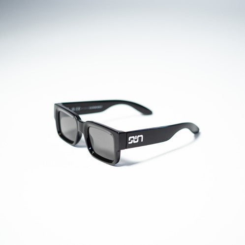
After starting out with multiple sketches of our first frame we've been drawing a variation for a logo. During this process I found that the logo should be as strong as the imprint of our favorite brands. After all, once you wear the product you're making it part of your appearance and this is usually a translation of your personality or your mood.
The logo can say a lot about the person wearing it on a certain product and we wanted SUNWIRHT's tag to be memorable. But also a true reflection of everything we stand for when it comes to our sunglasses. Modern takes on timeless design without any comprimise on style and quality. At SUNWIRHT we always think of sunglasses as an enhancement to the appearance of any face. That's why the first thought about the logo was that it should make the product look royal in a modern way.
At first we drew the SUN tag with a W on top of the U to make it look like an upside down crown. As sketching continued it became time to hire a professional to create the logo we know and love today for SUNWIRHT.

A few sessions followed to talk about the vision of the brand and what the logo should look like. A number of variations were presented by Jordey Caprino. Upon our earliest variations he came up with some more adaptations of the logo.

All great options, but we still felt like something was missing. It lacked the modern element we were looking for. But after going back to the first mood boards, Jordey found the perfect element to piece the logo and our views together into the logo we know today.

The logo consists of pipe bends. A pattern is easily created with these pipe bends and also the crown is now part of the entire logo. After a good three weeks Jordey finalized the logo and we started to find manufacturers to create the first pair of SUNWIRHT sunglasses.
More on that soon...
